How to Choose the Right Colour Combination for Your Artwork & Why It Matters ?
Understand the importance of colour combinations and learn how to select colours that enhance your artwork
When we start any artwork, most of us focus on the design, drawing, or pattern first. But one thing that can completely change the final look of an artwork is the colour combination.The same design can look average with one colour combination and amazing with another. That is why understanding colours is very important for every artist.
How to Choose Colours for Different Art Forms
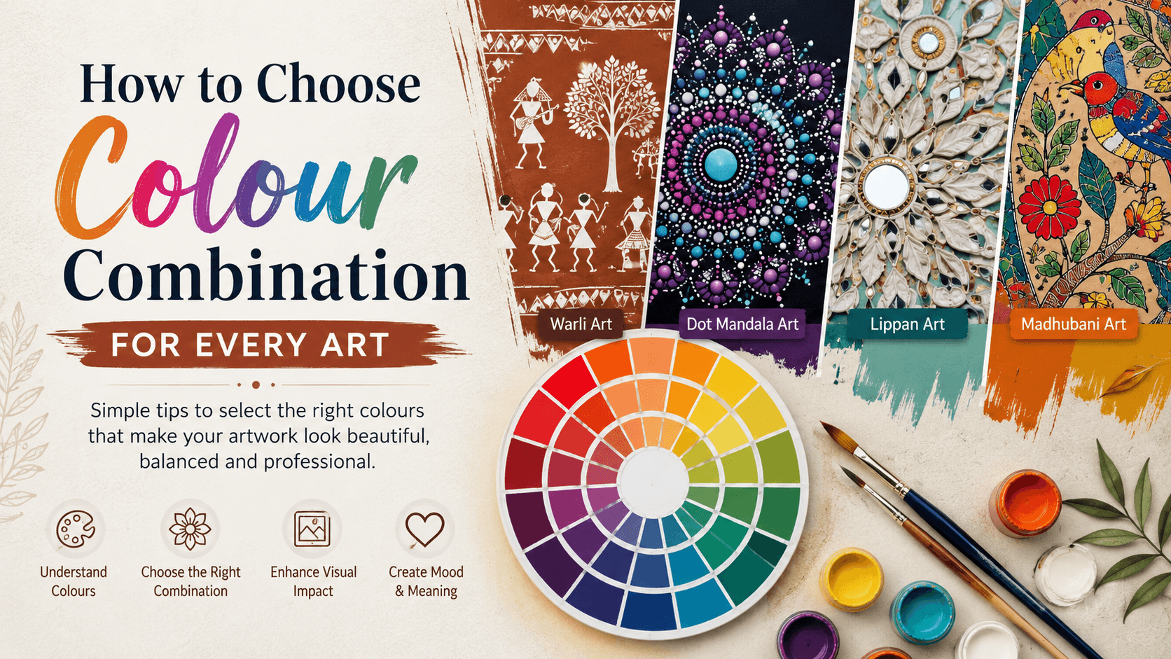
1. Warli Art
Traditional Warli art is known for its simple and earthy look
Best colour choices:
Brown background with white painting
Terracotta shades
Mud colours
Beige and cream tones
Why?These colours represent the natural lifestyle and culture of the Warli tribe. Bright colours may reduce the traditional feel of the artwork.
2. Dot Mandala Art
Dot Mandala is all about patterns and visual impact.
Best colour choices:
Blue and turquoise
Purple and pink
Gold with black
Rainbow gradients
White on dark backgrounds
Why?Mandala designs contain many layers. Contrasting colours help the patterns stand out and make the artwork look vibrant.
3. Lippan Art
Lippan art traditionally uses mirrors, so colours should support the mirror work.
Best colour choices:
White and beige
Earthy browns
Teal and gold
Grey and silver
Pastel shades
Why?Simple and elegant colours allow the mirrors to become the main attraction of the artwork.
4. Madhubani Art
Madhubani art is famous for its colourful and lively appearance.
Best colour choices:
Red, yellow, green, and blue
Bright traditional Indian colours
Natural colour-inspired combinations
Why?Madhubani paintings often tell stories and depict celebrations, so bright colours help create that festive feeling.
Simple Tips for Choosing Colours
Start with One Main Colour
Choose one colour that you want to dominate the artwork. Then select supporting colours around it.
Use 60-30-10 Rule
A simple rule used by many artists and designers:
60% Main Colour
30% Secondary Colour
10% Accent Colour
This creates balance and prevents the artwork from looking too busy.
Think About the Purpose
Ask yourself:
Is this artwork for a modern home?
Is it for traditional decor?
Is it for gifting?
Is it for a festive occasion?
The purpose often helps you choose the right colours.
Save Colour References
Whenever you see a beautiful colour combination on Pinterest, Instagram, or in nature, save it. Over time, you will build your own collection of colour inspirations.
Final Thoughts
There is no single "perfect" colour combination. Every artist develops their own style with experience. The more colour combinations you try, the better your understanding becomes.
Don't be afraid to experiment. Sometimes the most beautiful artworks come from colour combinations that you never planned to use.
Remember, good colours don't just make an artwork look beautiful—they make people stop, look, and remember it.